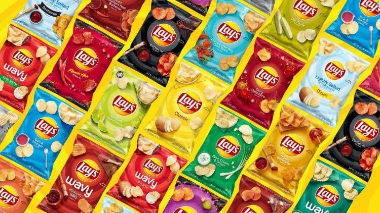
The household brand is getting a new look to make it feel more modern and contemporary.
According to Jon Guerra, senior director of design at Frito-Lay, the redesign took two years to complete – specially focused to keep the brand relevant in the era of social media and content regeneration.
The new look features photographs taken from a ‘top down’ angle – an homage to the Instagram-style food pics.
They also feature a smaller logo, which is centralized with radiating rings.
The new packs will be rolled out in the US and Canada before being launched globally, and will be supported by a marketing campaign, including TV and digital ads flighted from mid-October.
“We wanted to convey with color photography and a logo refresh that Lay’s is a joyful and flavorful brand,” said Guerra.
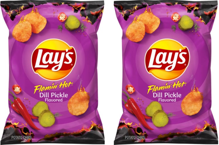
The redesign covers the entire spectrum of Lay’s flavor varieties, including its newest addition, Flamin’ Hot Dill Pickle.


